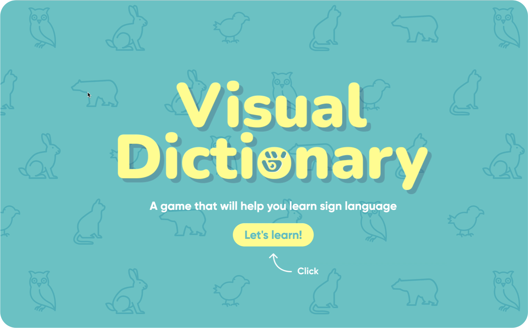
Visual Dictionary
Overview
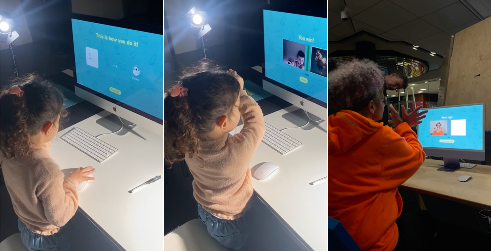
The Visual Dictionary teaches basic American Sign Language (ASL) through gesture and image. Users perform a sign in front of the webcam — when it is recognised, a matching photograph appears as feedback.
Challenge
Self-learning sign language is more challenging than learning a spoken language. Without a conversational partner, learners cannot easily check whether a sign they made was correct. We looked at established ASL self-study resources — Lifeprint, Handspeak, and YouTube tutorials. Most of them share the same two drawbacks:
Approach
We addressed both problems through a gamification approach — combining real-time gesture recognition with image-based reward.
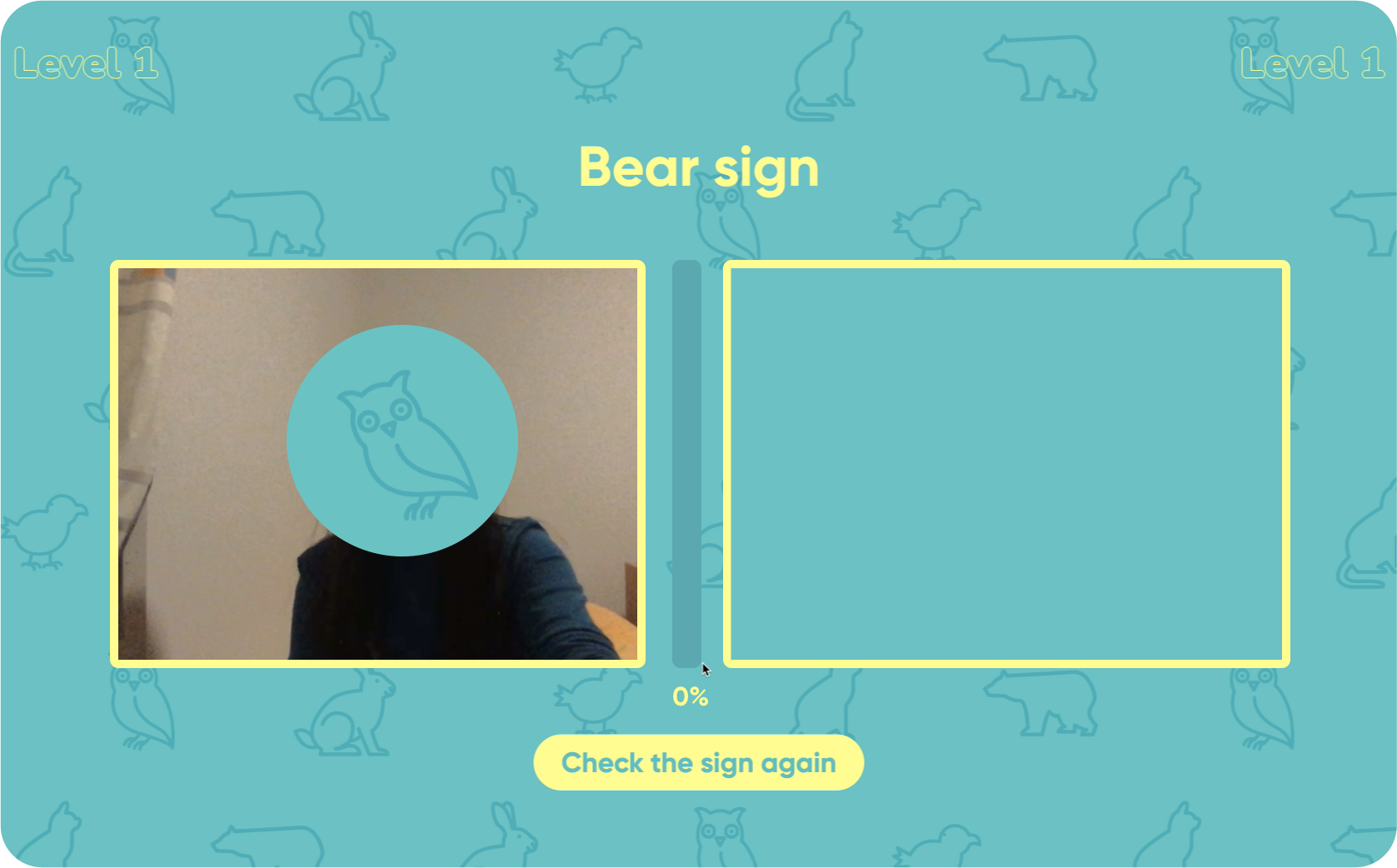
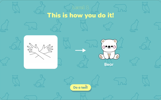
The webcam reads the user's hand. Users have to physically perform the sign, not just watch it.
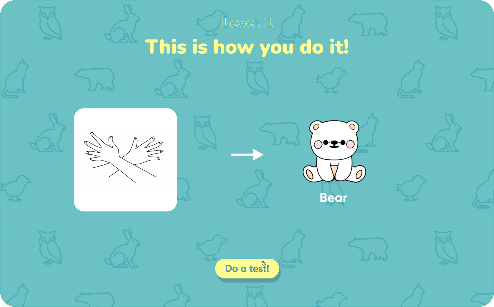
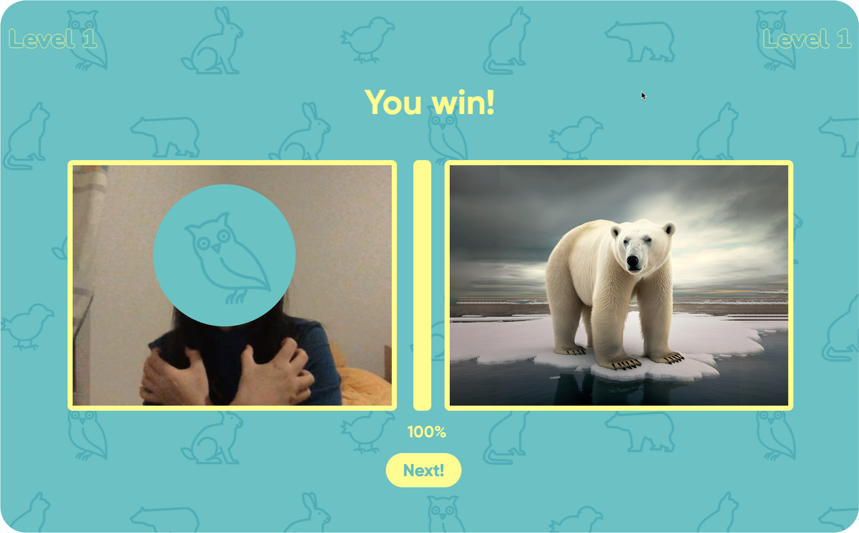
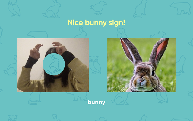
When a sign is recognised correctly, a matching photo of the animal appears — anchoring the sign to the thing it means.
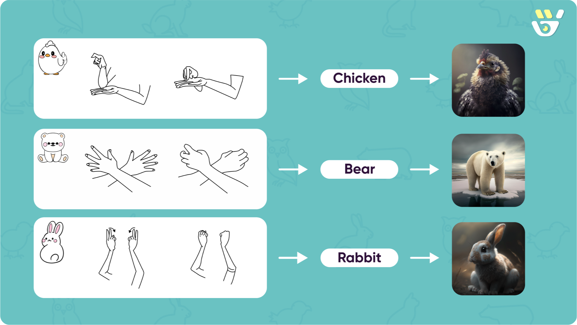
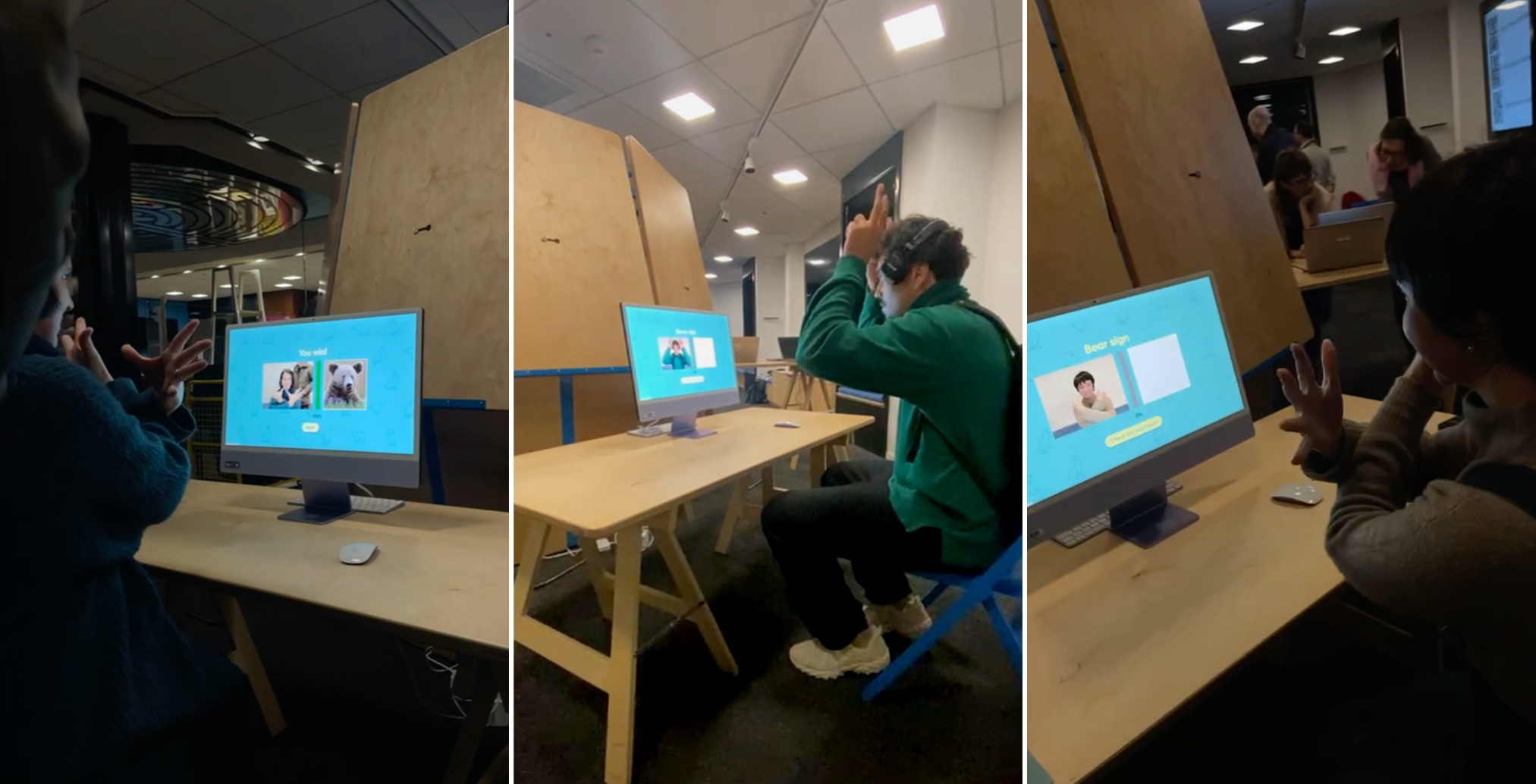
The prototype teaches three words — bear, chicken, and rabbit — one at a time.
Process
Designing within a constraint
The course brief required us to build with Teachable Machine, a tool for training small machine-learning models. Instead of treating real-time recognition as an extra feature, we looked for a context where it actually solves a real problem — which led us to sign language.
Why bear, chicken, rabbit
We chose concrete nouns because they make the product's main idea clearer. An animal can be rewarded with a real photograph — the most distinctive part of our approach. They also keep the tone friendly, fitting our audience of children and beginners. Abstract words like love, tomorrow, or please are where sign language is most expressive, but they need a more capable model than what we could build inside a short course.
From self-test to guided conversation
In our first working version, users were shown all three signs at once and then asked to perform them in a self-test. Early testing made the problem clear: users either froze at the test or forgot what they had just seen. We rebuilt the flow so that users learn one sign at a time, with a friendly character guiding them, and a visible reward after each correct sign.
Showing all signs at once → One sign at a time
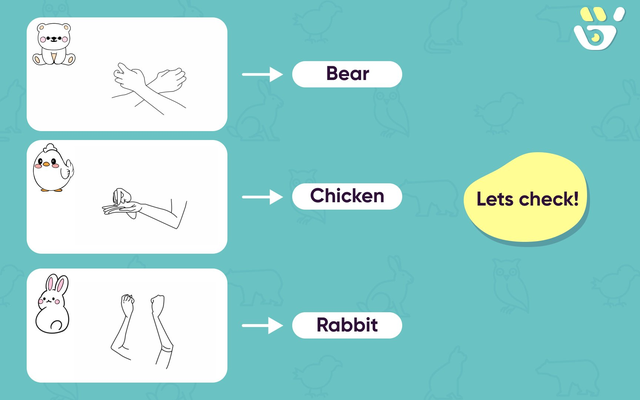
All three signs were shown together. Users had to remember every sign before practising any of them.
One sign at a time, organised into levels. Users only have to focus on a single concept per screen.
Cold self-test → Guided practice with feedback
A flat self-test. There was no clear instruction, no progress, and no reward after a correct sign.
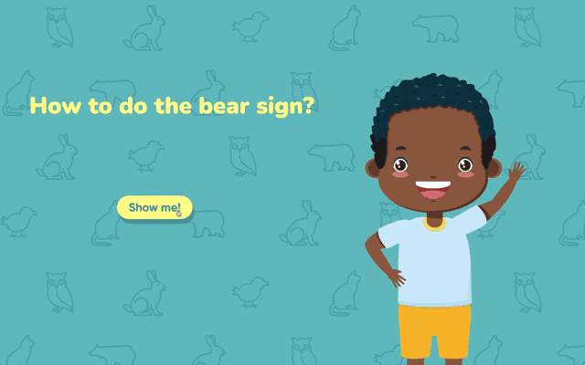
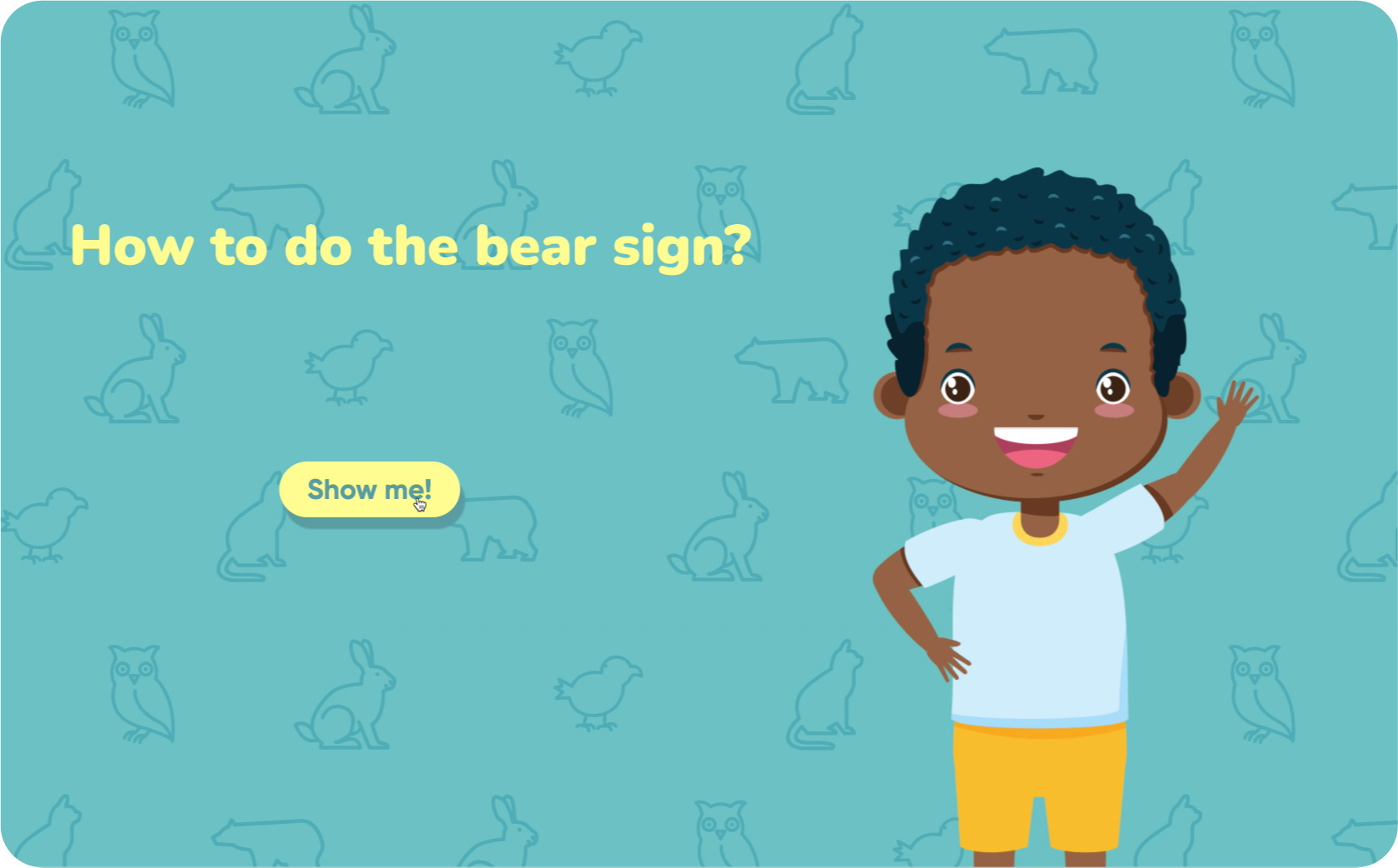
A friendly character asks the user ("How to do the bear sign?") and walks them through each sign. As the user performs the gesture, a progress bar fills from 0% to 100%. When it reaches 100%, a real photograph of the animal appears as the reward. Together, levels, progress, character, and reward turn the practice into a small game.
User Testing
We tested the project at our school's open day and at a public exhibition at the Bibliothèque de la Cité in Geneva. Participants ranged from young children to elderly people, with no prior ASL experience. Based on what we observed, we updated the user flow of the project — those updates are the v1 → v2 changes shown above.
Recognition accuracy varied across users, but those were technical limits outside the scope of design. What we could improve through design fed directly into the v1 → v2 rebuild above.
Reflection
On the work itself
The clearest weakness of the project is that recognition is not always accurate, especially across different lighting conditions, and the webpage is not fully responsive. The reason is that this project required us to be both designers and developers, but we are not trained as programmers — and the time was short. Our technical ability ended up shaping, and limiting, what the design could become. If I returned to this project, I'd want a developer on the team from the start.
On who this was really for
When we framed this project, we said it was designed for the Deaf and hard-of-hearing community. As we worked deeper into it, we realised that framing wasn't quite right: Deaf people learn ASL through their own schools and communities — they don't need a beginner app to learn their own language. The actual user is more likely the hearing person who wants to understand and communicate with them. That shifted the design question. Instead of asking "how do we teach ASL to Deaf users," it became "how do we help hearing learners take a first step toward a community whose language is not theirs." If I returned to this project, I would talk to both people who want to learn sign language and people from the Deaf community — not as test users, but the latter as the cultural and linguistic authority on the language we are teaching.
What the project taught me
Most of the useful design decisions in this project were not about colour or typography — they were about the interaction loop: when to show feedback, when to stay silent, what counts as a reward, what to leave out.